How to Customise Your Chat Widget
April 15, 2026
Customise your chat widget's colours, logo, position, greetings, and more — directly from your dashboard, no code required.
What You Can Customise
The Widget Customisation panel is divided into six accordion sections. Each section controls a distinct aspect of how the widget looks and behaves for your visitors. Open each section by clicking its heading — a live preview on the right updates in real time as you make changes.
- Widget Branding — background colour, text colour, brand logo, AI agent name and icon, widget title, widget message, start button text, and LenoChat branding visibility.
- Chat Content — a greeting message shown to visitors before they start chatting, and whether your agent's profile photo and name appear during an active conversation.
- Channels — add WhatsApp, Instagram, and Facebook Messenger contact links inside the widget so visitors can reach you on their preferred platform.
- Conversation Starters — create up to 10 pre-written question-and-answer chips that appear in the widget and guide visitors towards common topics instantly.
- Chat Bubble — control the minimised widget position (left or right of the screen), add a teaser message that floats above the bubble, and toggle sound notifications for incoming messages.
- Tracking Orders — if your Shopify store is connected, display an order tracking card and a bottom navigation shortcut inside the widget so customers can self-serve order status lookups.
Accessing Widget Customisation Settings
All customisation options are located in a single panel in your LenoChat dashboard. You can reach it in a few clicks, and every change you make is previewed live in the widget simulator on the right side of the screen before you commit it.
- Step 1: Log in to your LenoChat dashboard.
- Step 2: Click Settings in the left-hand navigation sidebar.
- Step 3: Select Widget Customisation from the settings menu.
- Step 4: The customisation panel opens with an accordion layout. Click any section heading to expand it. The live preview on the right reflects your changes in real time.
- Step 5: When you are satisfied with your changes across all sections, click the Save button. A confirmation notification confirms the settings have been applied.

Widget Branding: Colours, Logo, and Identity
The Widget Branding section controls the visual identity of your chat widget. Match it exactly to your brand's colour palette, upload a custom logo, configure the header text, and set the label on your start chat button. These settings make the widget feel like a native part of your website rather than a third-party tool.
- Background Colour — choose from 5 preset brand colours (#0078D4 blue, #76B5C5 teal, #EAB676 gold, #E28743 orange, #EEEEE4 cream) or enter any custom hex value using the colour picker.
- Text Colour — select from white (#FFFFFF) or dark (#252423) to ensure readability against your chosen background colour. LenoChat calculates luminance to suggest the better option, but you can override it.
- Brand Logo — upload an image file up to 5 MB to replace the default LenoChat logo in the widget header with your own brand mark. PNG, JPG, WebP, and SVG formats are accepted.
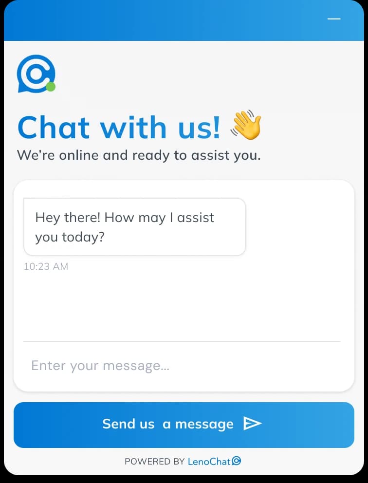
- Widget Title — set the heading shown at the top of the open chat widget, up to 100 characters. Common examples: your company name, 'Chat with us', or 'How can we help?'
- Widget Message — set a short line of supporting text displayed below the title, up to 100 characters. Use this to set response-time expectations: for example, 'We typically reply in under a minute.'
- Start Button Text — customise the label on the primary call-to-action button inside the widget, up to 50 characters. The default label is 'Start Chat', but you can personalise it to 'Talk to Us', 'Get Help', or any phrase that suits your brand.
- Widget Language — select the display language for all static UI elements visible to visitors, including button labels, input field placeholders, timestamps, and system messages.

Pro-Only Branding Features
Two branding options are exclusive to Pro plan workspaces: customising your AI agent's visual identity and removing the LenoChat branding badge. On Free and Plus plans, these options are visible in the panel but locked — clicking them opens an upgrade prompt.
- LenoChat Branding — on Free and Plus plans, a 'Powered by LenoChat' badge appears at the bottom of every widget. Pro plan workspaces can hide this badge by toggling Widget Branding → LenoChat Branding to OFF.
- Leno AI Agent Name — Pro plan workspaces can replace the default AI agent name ('Leno AI') with a custom name up to 40 characters. The custom name appears in the widget next to AI-generated messages, giving the AI a persona aligned to your brand.
- Leno AI Icon — Pro plan workspaces can upload a custom avatar for the AI agent (max 1 MB, recommended 256×256 px). This custom icon appears next to all messages generated by Leno AI, replacing the default Leno AI avatar.
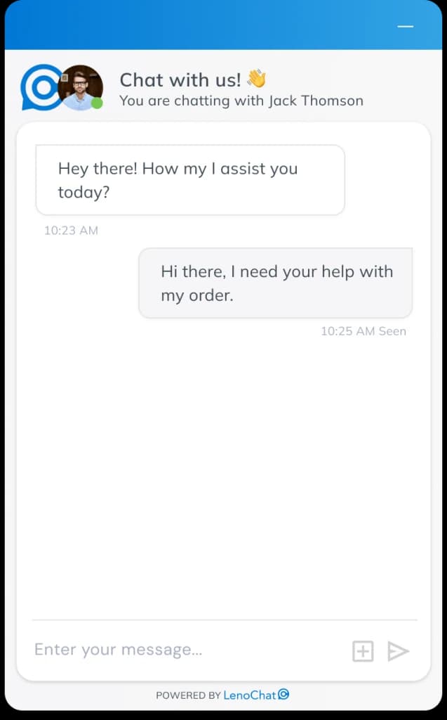
Chat Content: Greeting Message and Agent Profile
The Chat Content section configures what visitors see when they open the widget and how agents appear during a live conversation. Two settings work together to create a welcoming and personalised chat experience.
- Greeting Message — enable a welcome message that is shown at the top of the chat widget when a visitor opens it. Type your message (up to 250 characters) in the text field, then toggle Enable Greeting Message to ON. When disabled, the widget opens directly to the chat input area with no introductory text.
- Show Agents Profile — when this toggle is ON, the assigned agent's profile photo and display name appear in the widget header during an active conversation. This personalises the interaction and helps visitors identify who they are speaking with. When disabled, only the widget's default title and logo are shown in the header, regardless of which agent is handling the chat.
- To add an agent profile photo, each agent must upload a picture in their own profile settings under My Account → Profile Photo. The Widget Customisation panel only controls whether photos are displayed — uploading the photo is done at the agent level.
Chat Bubble: Position and Notifications
The Chat Bubble section controls how the widget appears in its minimised state on your website. You can choose which corner of the screen the bubble sits in, add a teaser message that floats above it to attract attention, and enable a sound alert so visitors are notified when a new message arrives.
- Bubble Location — toggle between Left and Right to place the minimised chat bubble in the bottom-left or bottom-right corner of the visitor's screen. Right is the default and most common position. The change takes effect on your live website immediately after saving.
- Chat Bubble Message — enable a small pop-up teaser text that floats above the chat bubble. Enter your message (up to 100 characters) in the text field and toggle Enable Chat Bubble Message to ON. An effective teaser message ('Questions? We're here!') can significantly increase widget open rates by prompting visitors who might otherwise overlook the bubble.
- Sound Notification — toggle Enable Sound Notification for Visitors to ON to play an audio chime in the visitor's browser when a new message arrives from an agent or Leno AI. This is particularly helpful for visitors who keep the chat open in a background tab — they hear the chime and return to the conversation without missing a reply.
Channels: Adding WhatsApp, Instagram, and Facebook
The Channels section lets you display contact links for WhatsApp, Instagram, and Facebook Messenger directly inside the chat widget. Visitors can tap or click a channel icon to open a conversation on their preferred platform without leaving your website.
- Step 1: Expand the Channels section and toggle Show Other Channels in the Chat Widget to ON.
- Step 2: Under Display Type, choose Icon Only for a compact appearance or Icon + Text to show the platform name next to each icon.
- Step 3: For each platform you want to add, toggle it visible and enter your contact details. WhatsApp requires a phone number (10–15 digits, optionally starting with +). Instagram requires your username (1–30 characters, letters, numbers, dots, and underscores). Facebook requires your Page ID (digits only, found in your Facebook Page settings).
- Step 4: Save your changes. On mobile, channel links open the native app directly (WhatsApp app, Instagram app, Facebook Messenger app). On desktop, links open the web version of each platform.
- You can enable or disable individual channels independently. For example, you can show WhatsApp and Instagram while keeping Facebook hidden, without needing to delete your Facebook Page ID.

Conversation Starters: Custom Q&A Suggestions
Conversation Starters are pre-written question-and-answer pairs that appear as tappable suggestion chips inside the open chat widget. When a visitor taps a starter, the question is sent automatically and the configured answer appears immediately — no wait time, no human agent needed. This is especially effective for directing visitors to your most common information requests.
- You can create up to 10 conversation starters per workspace. Each starter consists of a short question visible to the visitor and a longer answer that is delivered when the question is tapped.
- Each starter can be individually enabled or disabled without deleting it. Disable a starter temporarily when the information is outdated (for example, a seasonal promotion) and re-enable it later without needing to recreate it.
- Reorder starters by dragging them up and down in the list. The order you set here is exactly the order visitors see in the widget — put your most frequently asked questions first.
- To add a starter: click Add Conversation Starter, type the question text (keep it short and action-oriented — for example, 'What are your delivery times?'), write or paste your custom answer, then save. Conversation starter answers support plain text up to approximately 2,000 characters.
- To delete a starter: click the delete icon on the starter card. Deletion is immediate and cannot be undone. Disable rather than delete if you might need the starter again.
Offline Form: Capturing Leads After Hours
When your team is unavailable and Leno AI is not configured to continue handling conversations, the widget can display an offline contact form so visitors can leave their details and message. This ensures no enquiry is lost outside business hours.
- Step 1: In the Widget Customisation panel, click the Offline tab at the top (alongside the Appearance tab).
- Step 2: Toggle Enable Offline Form to ON.
- Step 3: Customise the form title (for example, 'We're away right now'), the supporting description, and which fields to collect. Name, email, and phone fields can each be set as optional or required depending on your needs.
- Step 4: Set the confirmation message visitors see after submitting the form — for example, 'Thanks! We'll reply within one business day.'
- Step 5: Save your changes. The offline form activates automatically when your workspace is outside the business hours you have configured in Chat Hours Settings.

Offline Message: Setting Your Away Text
The offline message is the text shown to visitors when they open the widget outside your configured business hours and the offline form is not enabled. A clear, helpful offline message sets expectations and can redirect visitors to self-service resources or alternative contact methods.
- Step 1: In Widget Customisation, click the Offline tab.
- Step 2: Under Offline Message, write your away message. Be specific about your response time — for example: 'We're offline right now. Leave your email and we'll reply within one business day.'
- Step 3: Save your changes. The message is shown automatically to visitors who open the widget outside your defined business hours.
